The term womxn is an alternative spelling of the English word woman to explicitly include transgender and nonbinary people.
The Problem
Gender inequality. Researching about this topic I found out that there are ways that organizations help and support women in many ways. However, it’s hard for people to find a source that combines knowledge and individual support.
How does this impact womxn today?
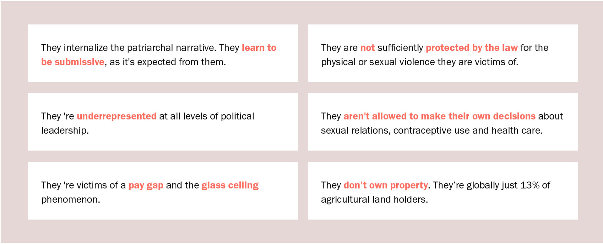
This information was found in www.un.org. There is unfortunately so much more. I tried to narrow down the facts that are more relatable to the womxn that would have access to internet.
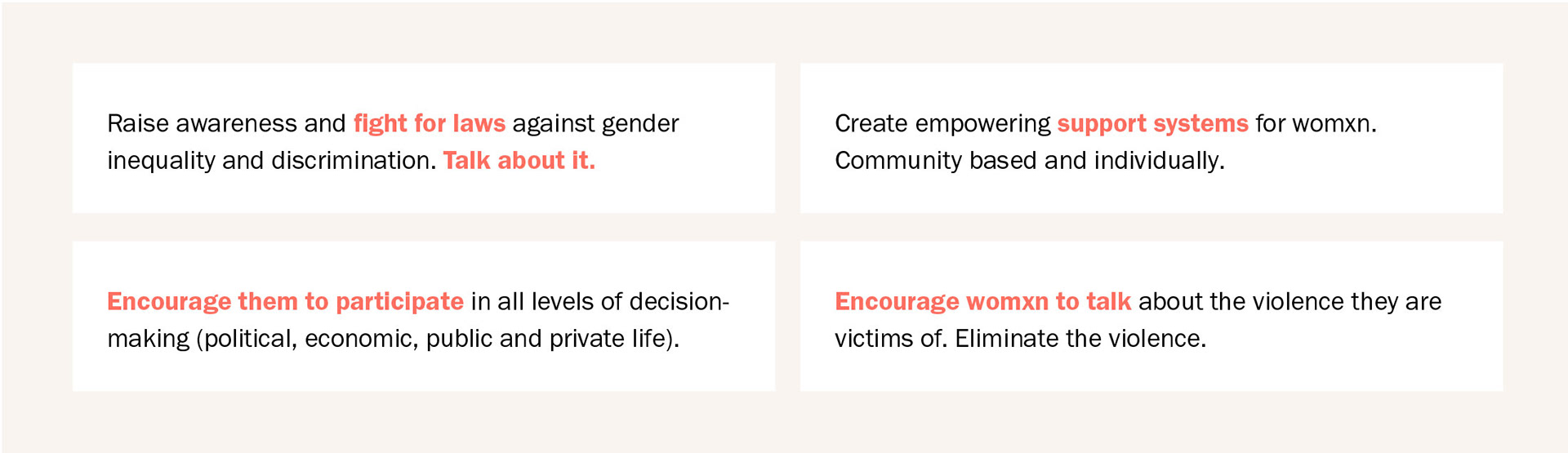
How can we help change this narrative and create positive impact?
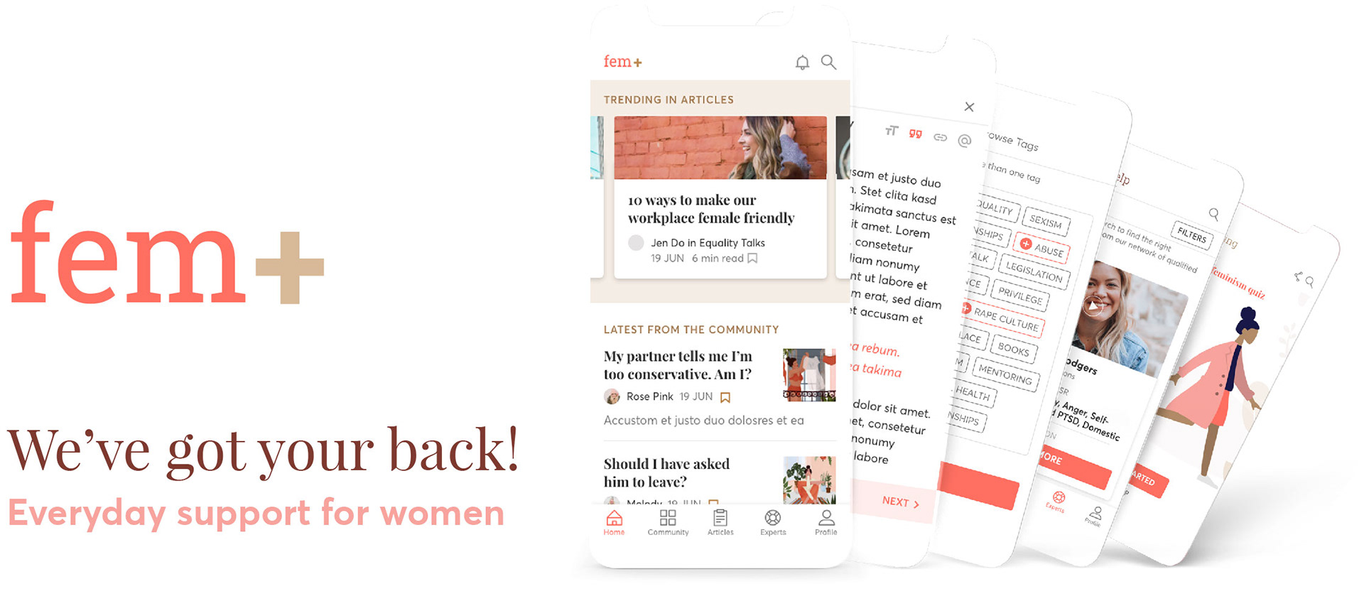
Introducing Fem+
A conceptual interactive prototype that creates a positive impact on the lives of womxn, by:
I creating a powerful and supporting online community,
I providing access to knowledge related to feminism,
I connecting the users with a range of trustworthy experts to receive individual support.
What makes Fem+ unique?
The combination of creating a safe place and providing individual counselling for the users.
My roles & Responsibilities
User Research I UX Design I UI Design
The HCD approach
My goal was to create a product that will make an impact on the life of the users, this is why I made it my first priority to understand the user's perspective. Using tools like user personas and user journeys I was able to document my findings and communicate the data visually with the stakeholders. Running usability tests and creating quick iterations helped me discover the pain points of the users while using the app and most importantly to identify the right problems before I start creating high-fidelity prototypes.
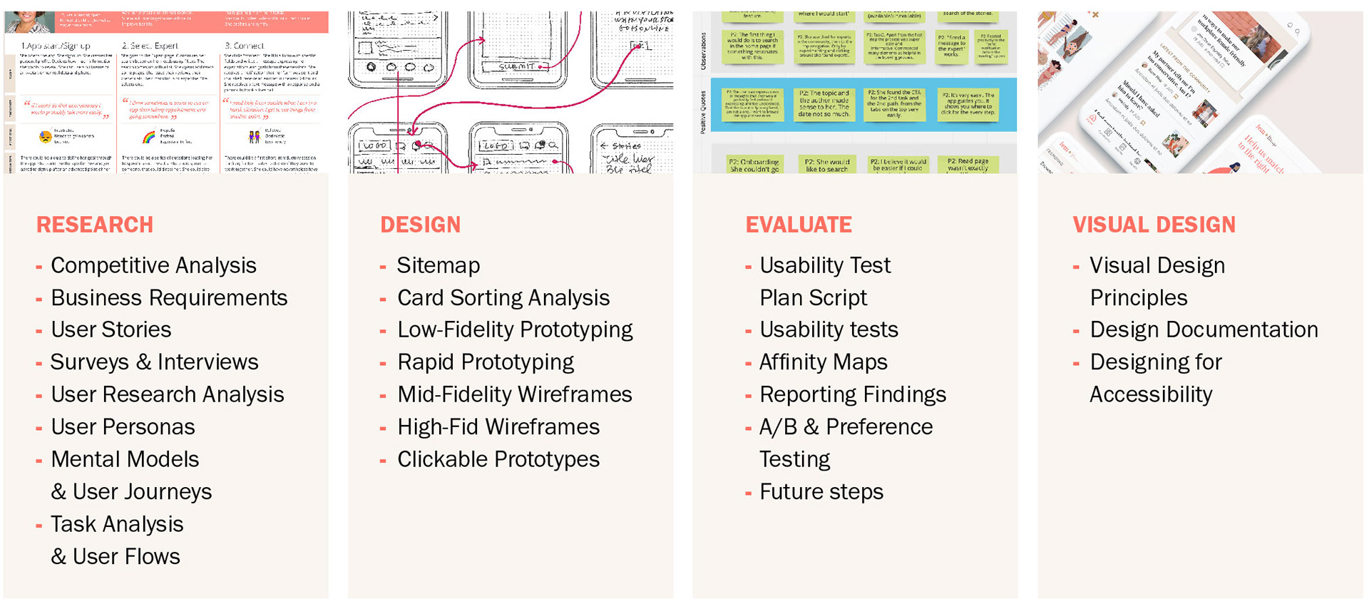
Researching the app's competition helped me make better-informed decisions about my overall strategy.
Competitive Analysis
As it was hard to find competitor apps in the market, I discovered indirect competitors that are relevant in terms of content (feminism), features (community, resources) and business goals/services (online consulting with an expert). I focused on user’s feedback aiming to gather knowledge about the points that bring value to them, as well as the points of friction they face.
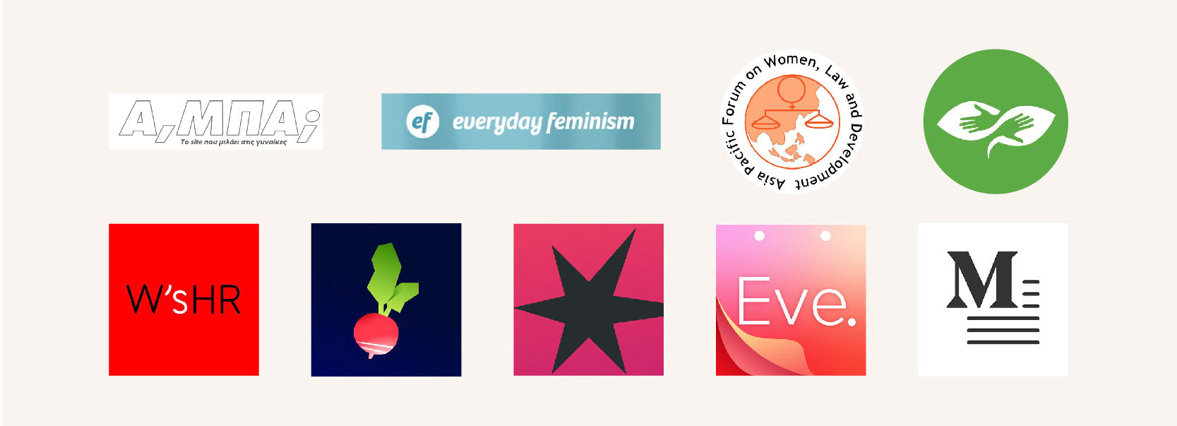
I found that:
I There are apps and websites in the market that have relevant features individually, but there aren't products that offer the combination of education, community-support and individual guidance.
I There are plenty of apps that focus on “women empowerment”. They focus on the symptoms instead of the fundamental root problem behind women's struggle to gain power.
I There are several apps that refer to specific markets by location, which seem to only serve a specific part of the population.
I Users can find several counselling tools online, but there isn't one that covers this specific niche, or with a variety of experts. Usually they focus only on psychotherapy, coaching etc.
Therefore, I aimed to create a product that can be useful to a broader audience and at the same time to provide users the tools to tailor their experience to their personal needs.
Before I dive in the user research/survey stage, I communicated the stakeholders all information concerning the scope of the project. The business objectives, the functional requirements, the delivery schedule as well as the risks and opportunities of the product to keep everyone aligned and informed.
User Research
I combined user surveys and user interviews to gather knowledge and gain clarity about my problem statements and my objectives.
My research goals were:
I To identify my target group.
I To understand the user's needs.
I To document possible user pain points or positive effects using similar products in the market.
I To determine if conducting counselling calls through an app is an appealing feature.
I To understand if the users are interested in being part of such an online community and in sharing their personal stories.
User Survey
The user survey attracted 70 people in 36 hours and almost all of them answered the open questions with helpful answers. I observed some patterns in the way people react to the idea of online consulting.
This data is only qualitative and doesn't offer me clear insights. Gathering different opinions however help me understand the variety of the user's concerns, and gain insights about how they think in a broader sense.
For example:
I A few people showed scepticism for consulting a therapist online, but not so much with coaches.
I Someone shared they would like consultation on career and psychotherapy. But they’re not sure how much the psychotherapy is gonna help with patriarchy.
I Anonymity is a plus for several people.
I Some said they would use an app to search for a professional, but wouldn’t actually get in touch with a professional. They’d rather have the face-to-face interaction.
I 1 person was not entirely reassured about the privacy of their personal data
I A couple of people said they would prefer experts that come from personal recommendations.
I A few people would find it easier to use an app than taking appointments and go somewhere
I Some would be happy not having to search for all this information or data and find everything in one place.
I Some talked about the positive effect of belonging to a community and receiving feedback.
I Some needed some reassurance about the credibility of the experts/app.
User Interviews
I conducted 5 interviews. User N#1 (43) is a feminist and activist in the field. Users N#2 (60) and N#3 (37) use similar tools. and define themselves as feminists, users N#4 (16) and N#5 (43) are quite ignorant of these concepts.
The research goals remained the same but I added some questions that were not directly about the app, but more about how women respond to these issues when they confront them personally. I started my research by approaching cis white women, but the app aims to be helpful to a wide range of people that are affected by patriarchy, regardless of race, religion, national origin, gender, sexual orientation, age, marital or ability/disability status. Therefore my goal is to add voices in the next rounds of interviews or user testings that represent all social groups.
The talks were fascinating and eye opening. I used open sorting to form clusters from my learnings.
I found that:
I FEMINISM Even womxn that believe in gender equality find it difficult to identify themselves as feminists. The word itself is negatively connotated. The #metoo movement (where women talked in public about their stories of abuse and harassment) helped rebrand the word and many womxn to use it.
I APP The users are in different age groups and all of them seem reluctant to use mobile apps. They are open to navigating websites/forums with their desktop/laptop.
I COMMUNITIES They all rooted for the benefits of communities, where they can read and interact with the posts with stories from other womxn. They feel less alone. They feel empowered and comforted when they observe that their problem is not only their personal problem, but a situation that all womxn face. Also when they read stories of women opening up, showing their vulnerability and weakness, it makes it easier for them to face their fears and feelings of shame, to develop resilience and share their stories as well.
I MODERATION The ones that have experience with similar tools talked about the importance of effective moderation. They expect the moderators of the app to act quickly and respond to comments that aim to create confusion. Also they expect to learn from the analysis and advice that the app's moderation provides.
I EXPERTS Online counselling and interaction seems as a less scary option to people that aren't already so tech friendly, especially in the post covid era. They all agreed that experts that are recommended from an online community, in which they feel safe, are a great option that they would consider using.
I FEATURES Talking about what other apps offer, or exploring their desires and expectations several ideas came up. Some have to do with content (parenting, motherhood, legislation, etc), some with specific features (participating in live discussions about specific issues, group therapy sessions, direct interaction between the members, search specific content, adding a quiz or fun facts/tips, make it more playful, contributing with their own texts to the content).
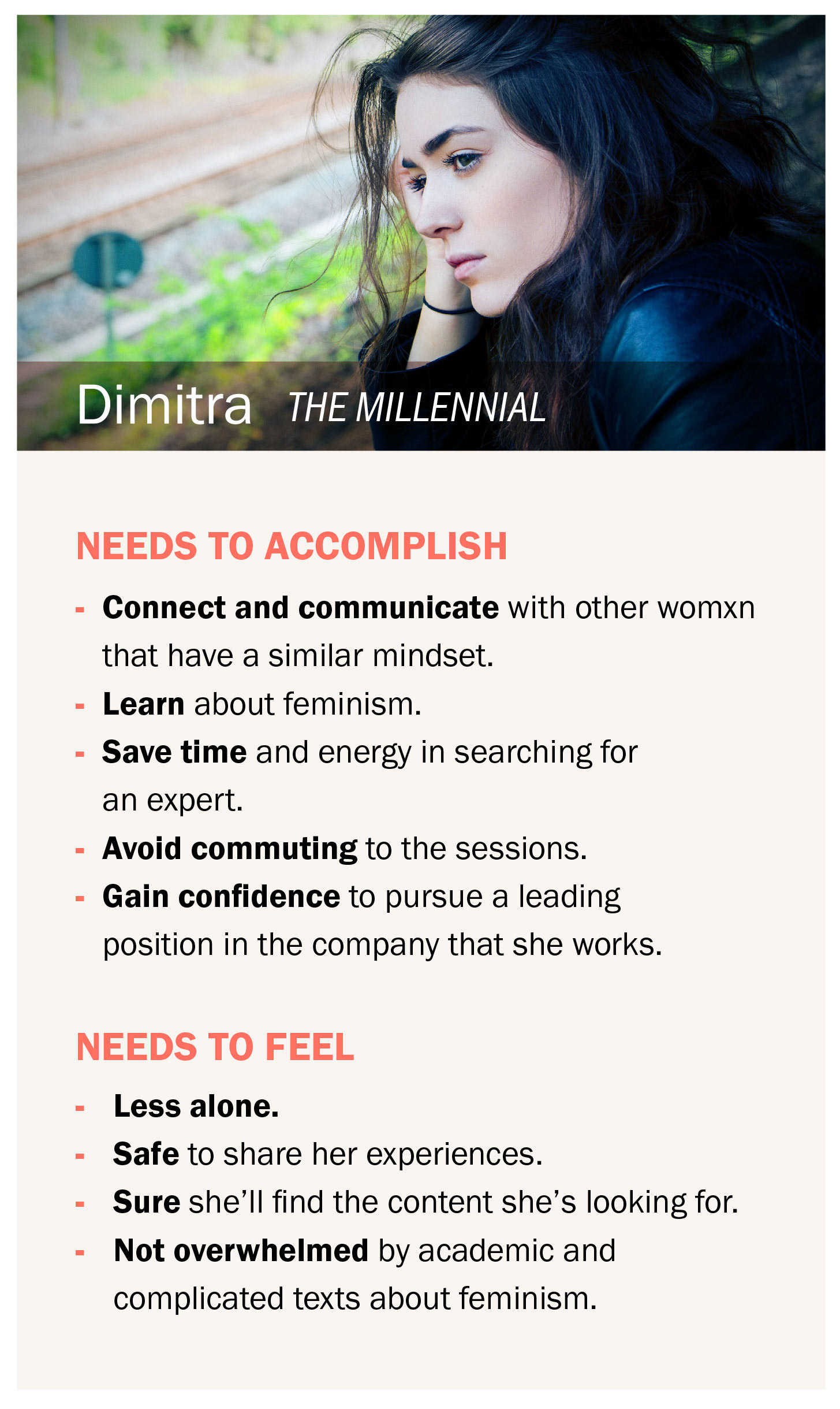
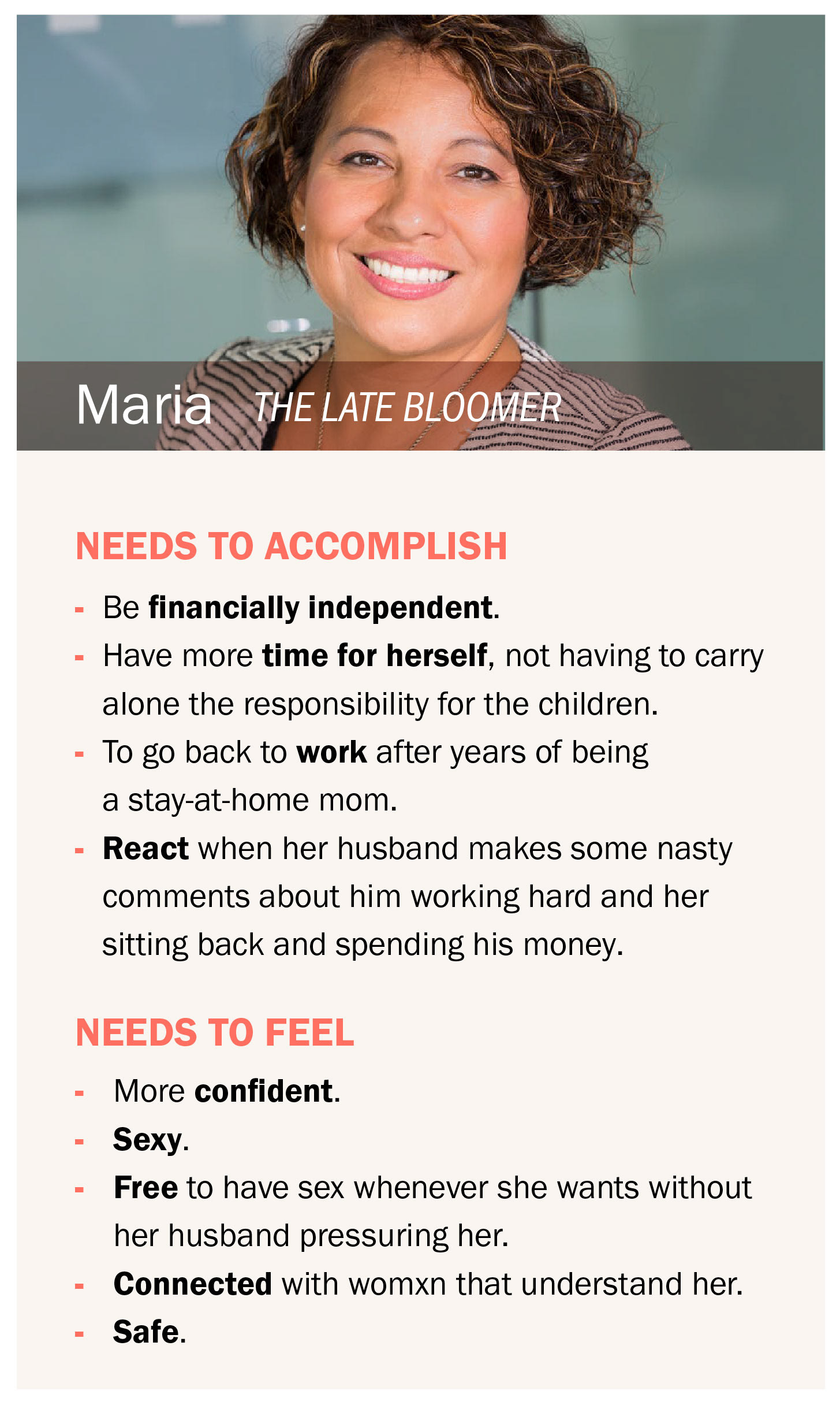
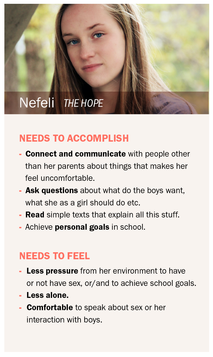
Based on my research I created 4 personas to help me stay connected to the users and their needs, as well as to ensure alignment amongst the stakeholders.
Filtering my research findings and having the personas in mind, I did a brainstorming session. I wrote down as many ideas as possible without considering feasibility at this stage. I went through the ideas and narrowed them down to the most vital functionalities of the app, in order to create a MVP.
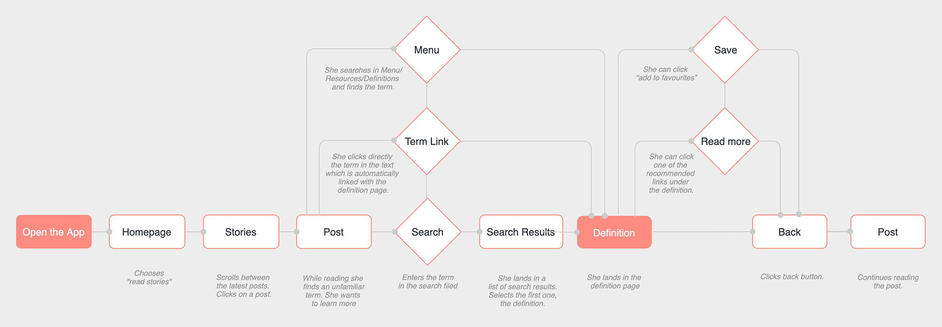
Creating user flows and user journeys helped me move on with my design decisions without forgetting the user's goals and needs.
USER FLOW 1
I Search specific content
I Search specific content
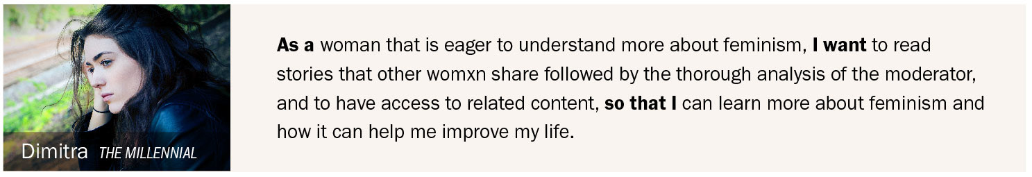
User story for Dimitra (persona 1)
ABOUT THE TASK: Dimitra is frustrated by the way the media talks about these issues. In this app she can read and learn. Following this flow her goal is to find the information she’s looking for.
USER FLOW 2
I Connect to an expert
I Connect to an expert
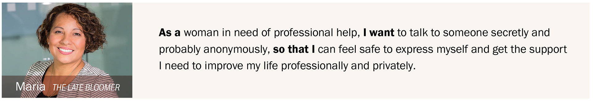
User story for Maria (persona 2)
ABOUT THE TASK: Maria is unhappy with her marriage. She’s stuck professionally. In this app she can feel safe and find the professional help she needs. Following this flow her goal is to connect with a counsellor.

USER FLOW 3
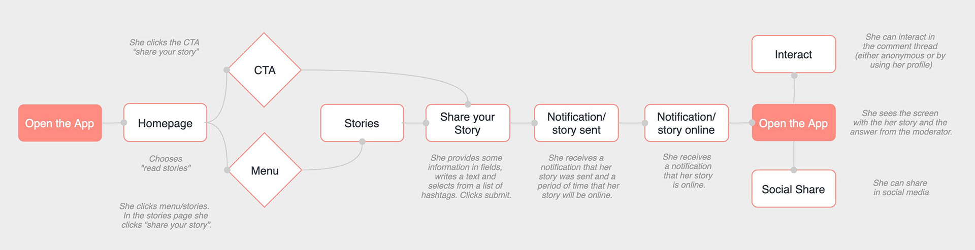
I Share a story
I Share a story
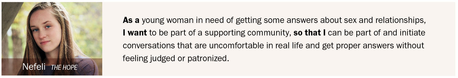
User story for Nefeli (persona 3)
ABOUT THE TASK: Nefeli has questions, she wants to talk about her experience and feels uncomfortable to talk with people around her, like family and friends. Following this flow her goal is to share her story/ask a question and get the answers she needs.
USER FLOW 4
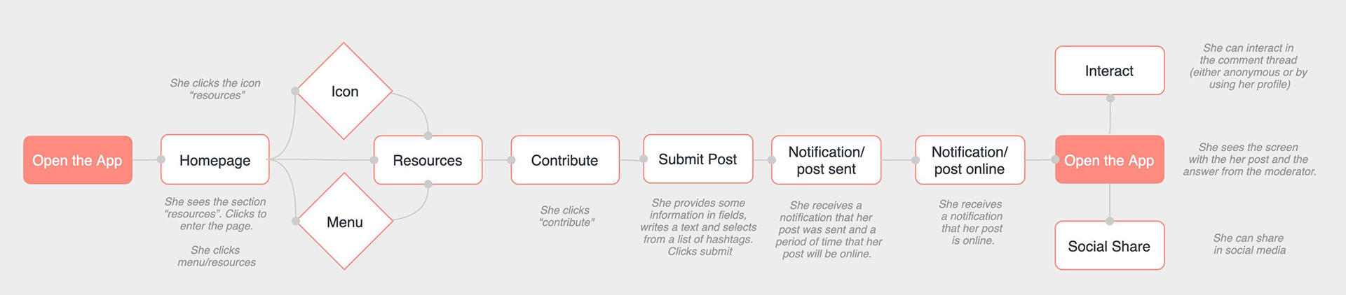
I Post an article
I Post an article
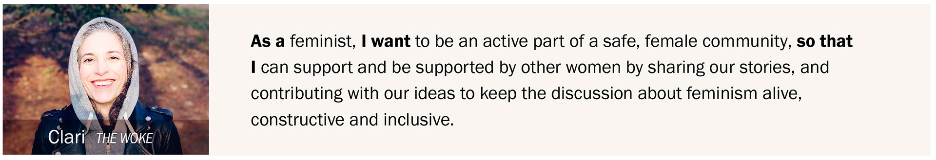
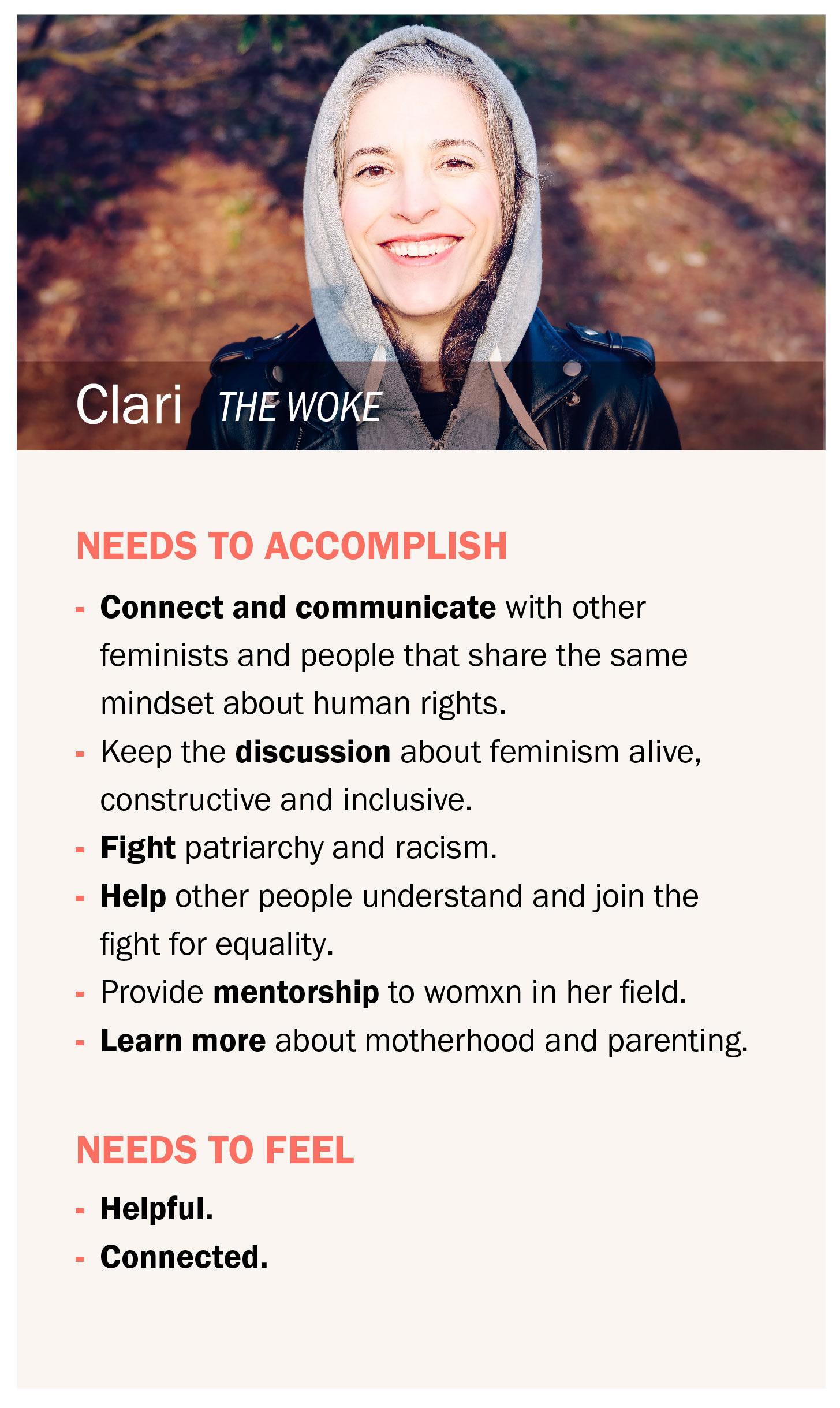
User story for Clari (persona 4)
ABOUT THE TASK: Clari has deep knowledge of the subject and wants to share her ideas with the community. Following this flow her goal is to post an article and contribute with her ideas.
Before I jump to the ideation process, I created a sitemap to outline the hierarchy of the app.
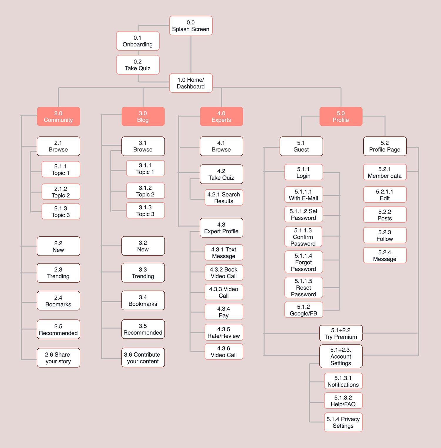
This was the first attempt to design the information architecture of the app and define the different levels of hierarchy. Since then there were updated versions, where changes were made to improve the user experience.
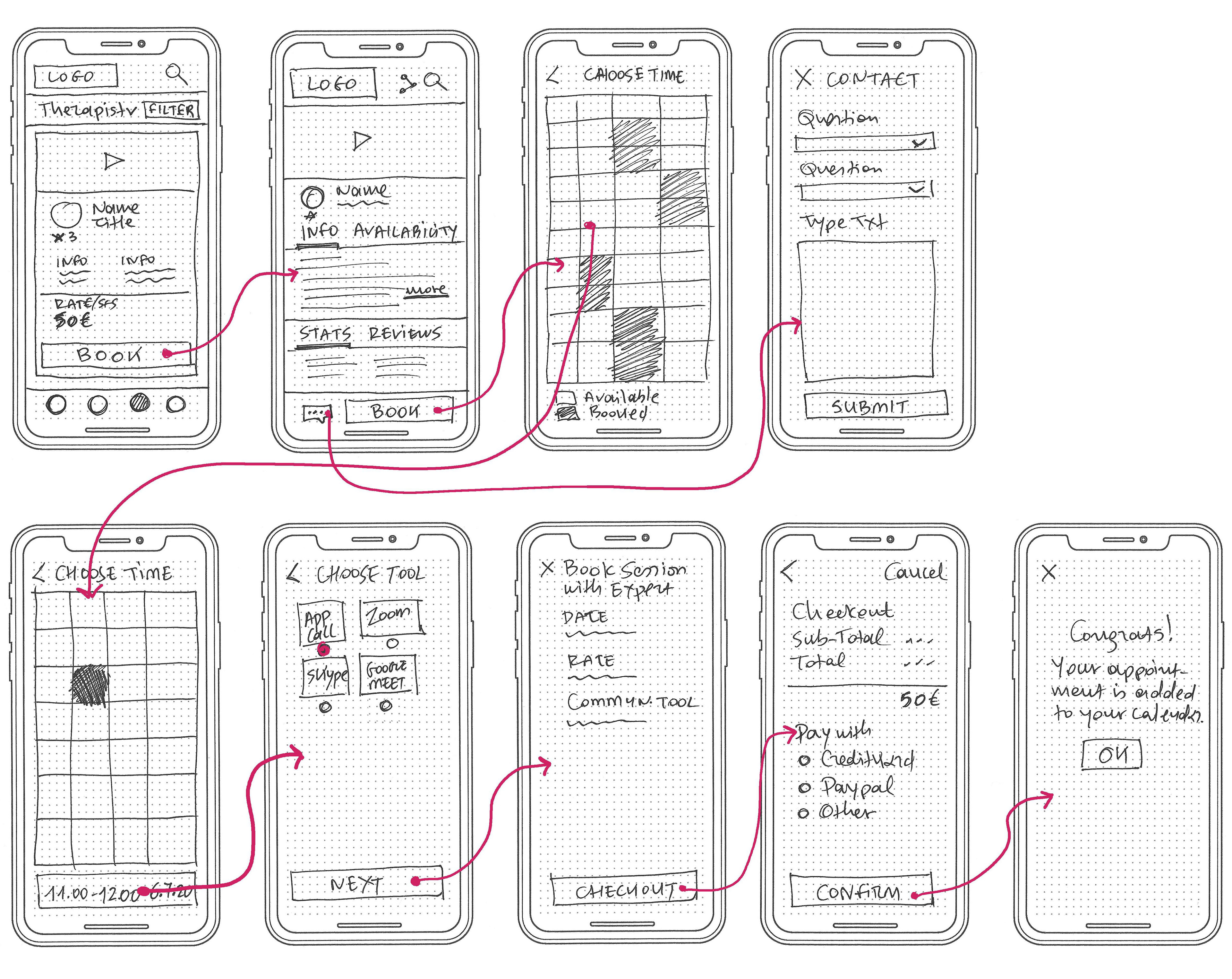
Starting by drawing out sketches of the core functionalities and moving on to designing low-fidelity and high-fidelity prototypes, I was able to ideate how these first user flows could look like.
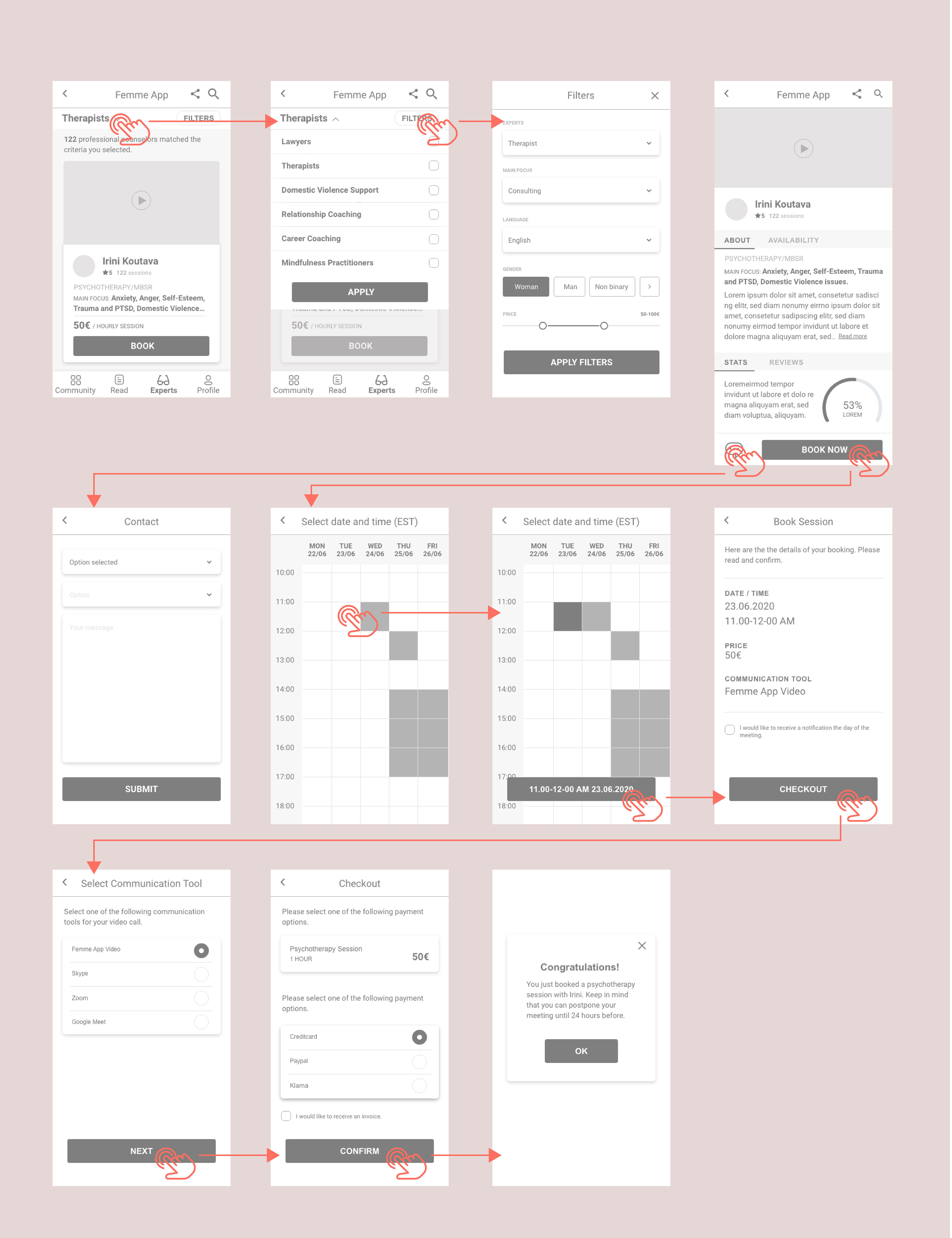
Wireframes & Prototypes
To be able to test my ideas, I transformed them into a physical format so that the potential user can interact with them. Low and high fidelity wireframes evolve to an interactive prototype. My focus initially was to define the actions the user has to take to book a call with an expert.
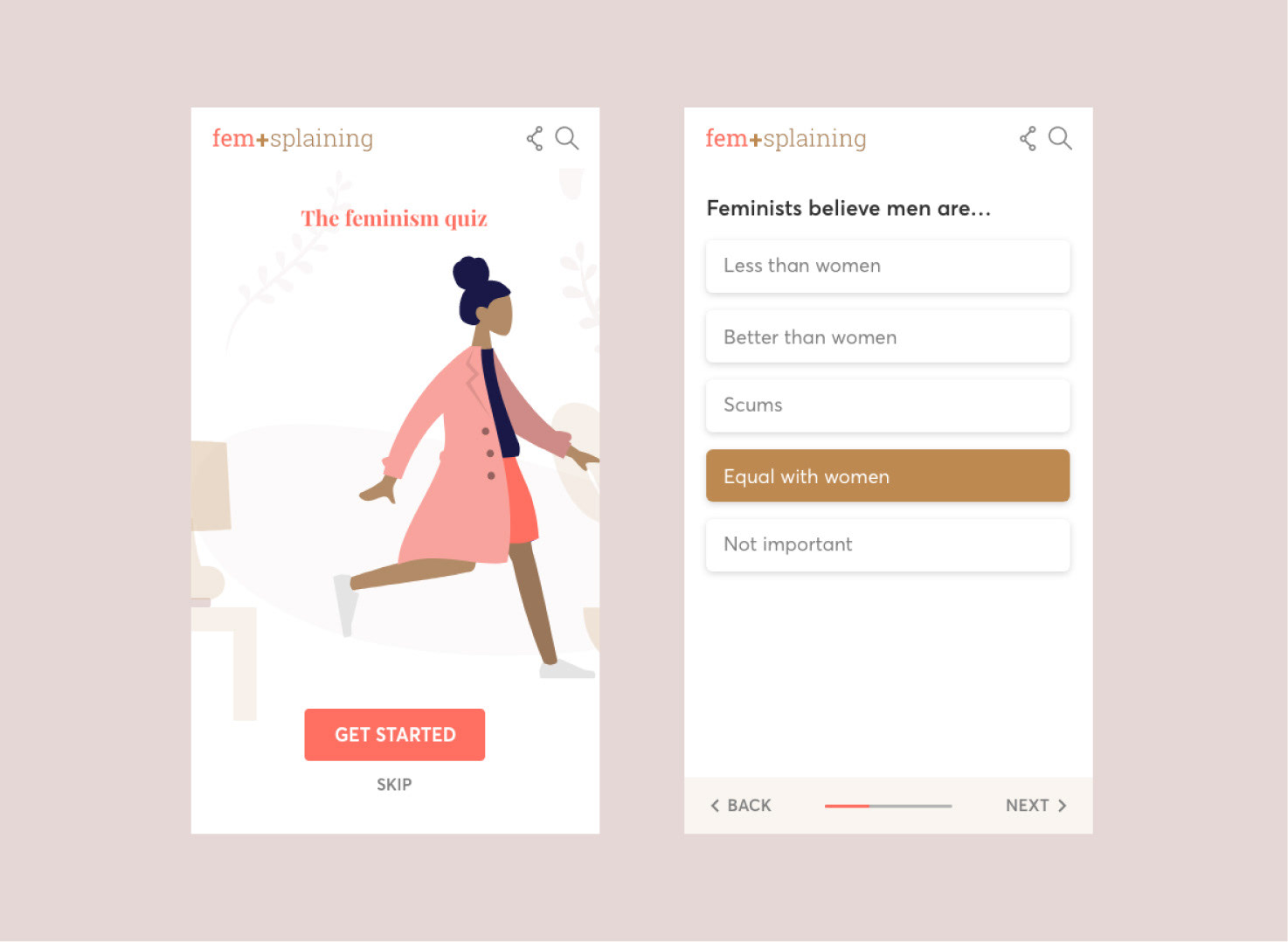
Low-Fidelity prototypes
High-Fidelity prototypes
Usability Testing
Having designed a potential solution to the user's problems, I tested my design decisions with people that represent the app's target group. With usability testing I was able to see how quickly and efficiently users interact using the app as well as to observe their behaviour and psychology.
Before starting the evaluation phase, a document with the usability plan script and usability plan was written to hand out to the interviewees. This document provided clarity about the objectives and the process of the tests.
I added 2 user flows to my prototype to test all 3 core functionalities of the product.
My goal was to understand whether the users can see the multiple ways they can use the app and benefit from it. Also to observe how they navigate their way to their goals through the given tasks and where possible pain points show up.
Usability Test Plan
Tasks
I Book a call with an expert
I Share a story
I Share a story
I Search specific resources
The on-boarding and the sign up / log in process were part of the user's journey to complete these tasks.
Questions
Can the user find the relevant points of navigation to deliver the tasks?
Do they understand how the filters and the booking process works? Does the process feel smooth and effortless?
Is there a friction point? Is the structure of the screens helpful?
Does the user understand what the app is about?
Do they take the time to read the onboarding screens or do they want to skip and move on? If so, is it easy to navigate their way forward?
Can the user easily log in or create an account?
Can they find the steps intuitively or does it seem like they have to search?
Participants
I recruited 6 participants. 2 women that help me reach personas Dimitra and Maria. A feminist friend, to have the perspective of Clari. I had 1 participant that is closer to Nefeli, the younger target group, which is very important. Lastly I recruited 2 random women.
Method
All tests were conducted moderated remote and were recorded using zoom and skype. I chose this method because it made it easier to approach women from all over the world, and because the tests were conducted during the pandemic isolation.
Here's a brief overview of the process:
I Introduce the project objectives, brief the users about the process, set up a friendly environment.
I Describe the scenario, let users perform the given tasks while thinking aloud.
I Ask follow up questions, gather feedback about their views and overall experience.
I Thank them for participation.
All 6 participants were able to complete the scenario tasks and described their overall interaction with the app as easy, guided and intuitive.
Findings
All of them were also willing to recommend the app to a friend, and believe that the product can provide value and be helpful to womxn.
Nevertheless some issues came into light. I created an affinity map (see examples below) and a detailed rainbow spreadsheet to gather my observations and evaluate my findings.
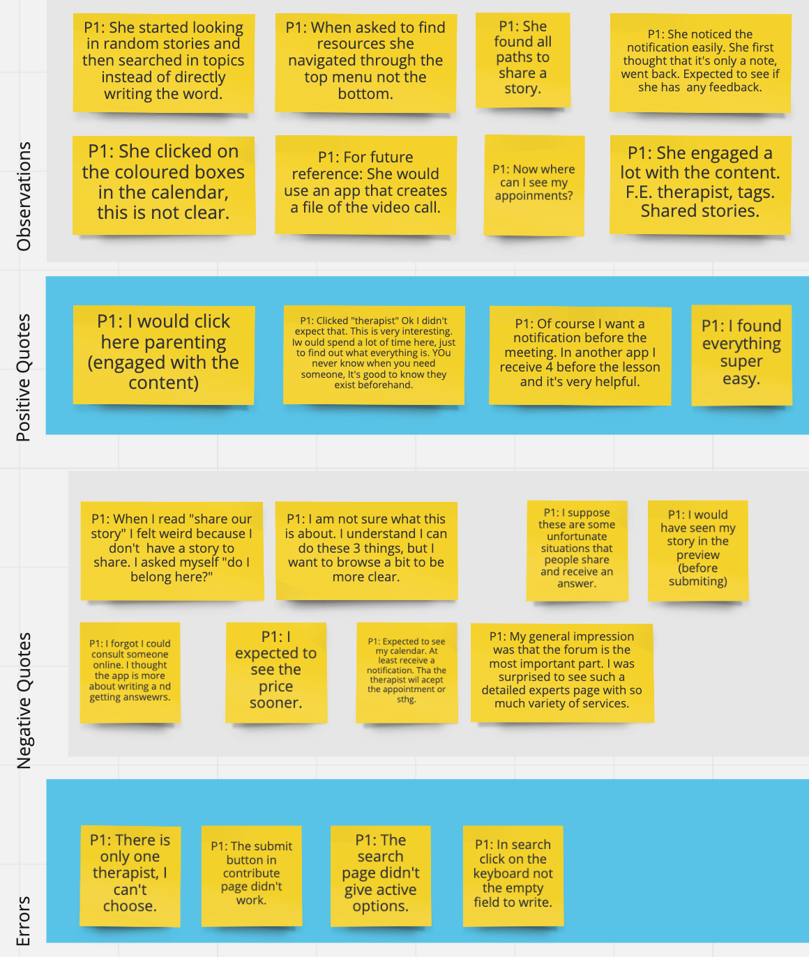
Affinity map with notes from usability test with participant 1
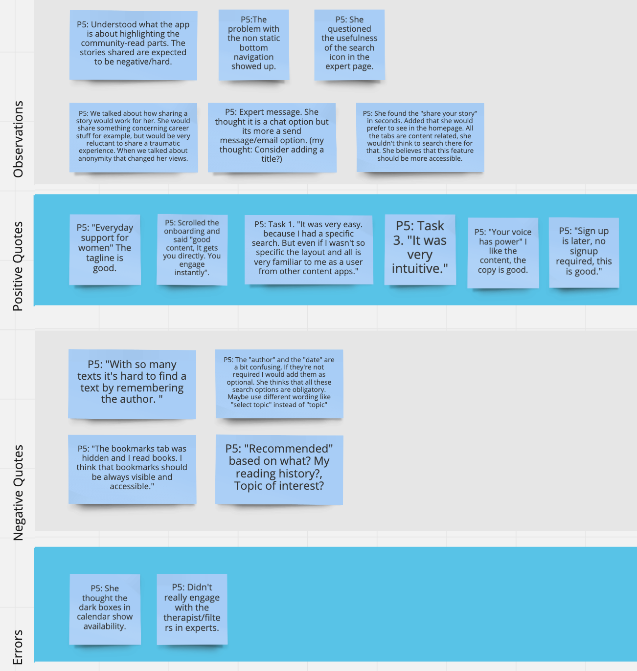
Affinity map with notes from usability test with participant 5
Using Jakob Nielsen’s four-step rating scale, I categorized and ranked the severity of errors that showed up. I identified the top 5 errors to be addressed in the next iteration and accordingly the less important for the next iteration rounds.
Top 5 errors
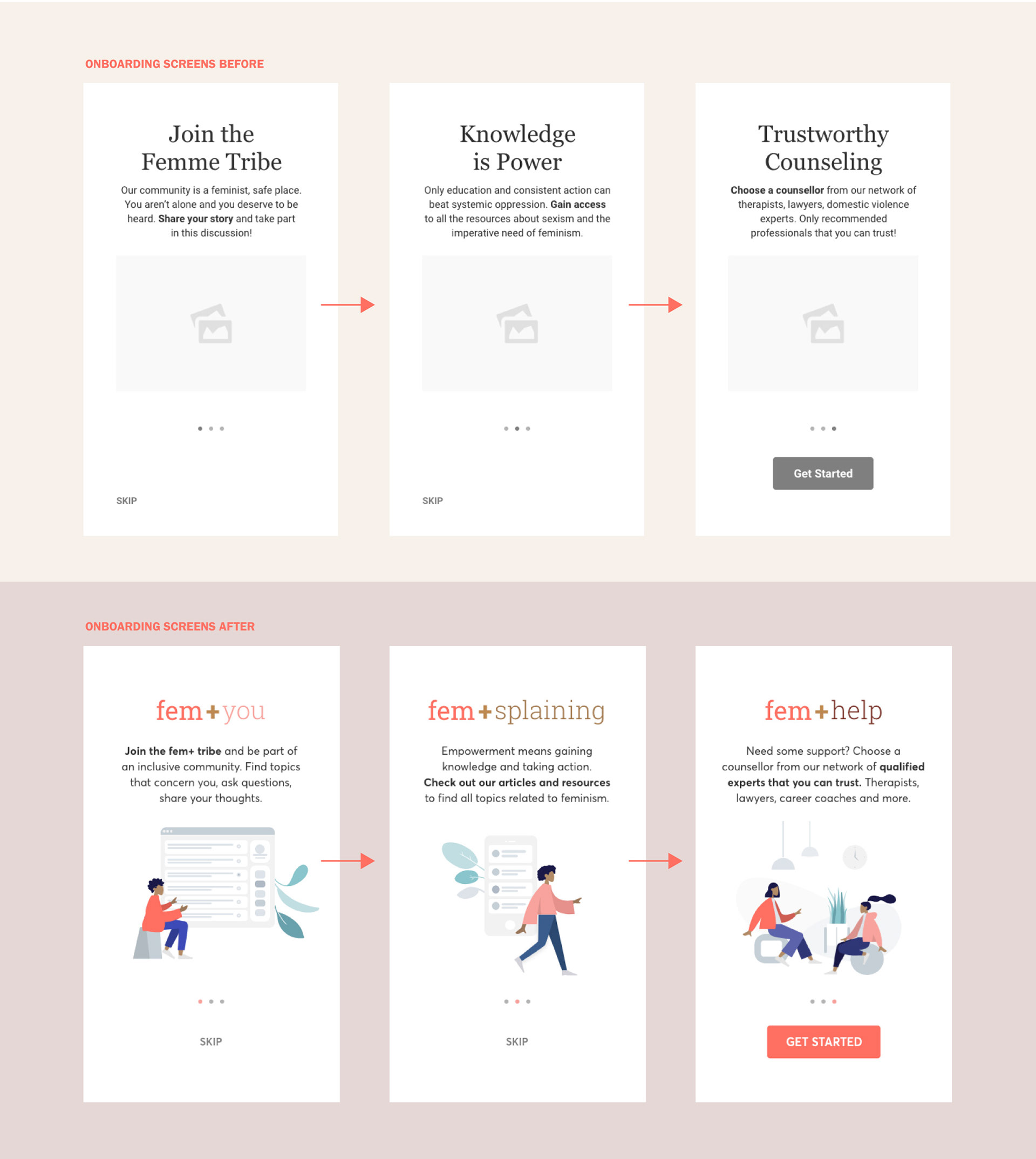
I Users get the impression from the onboarding screens that fem+ targets women with serious abuse experience or other negative scenarios, while the app wants to include and engage all womxn in an empowering community.
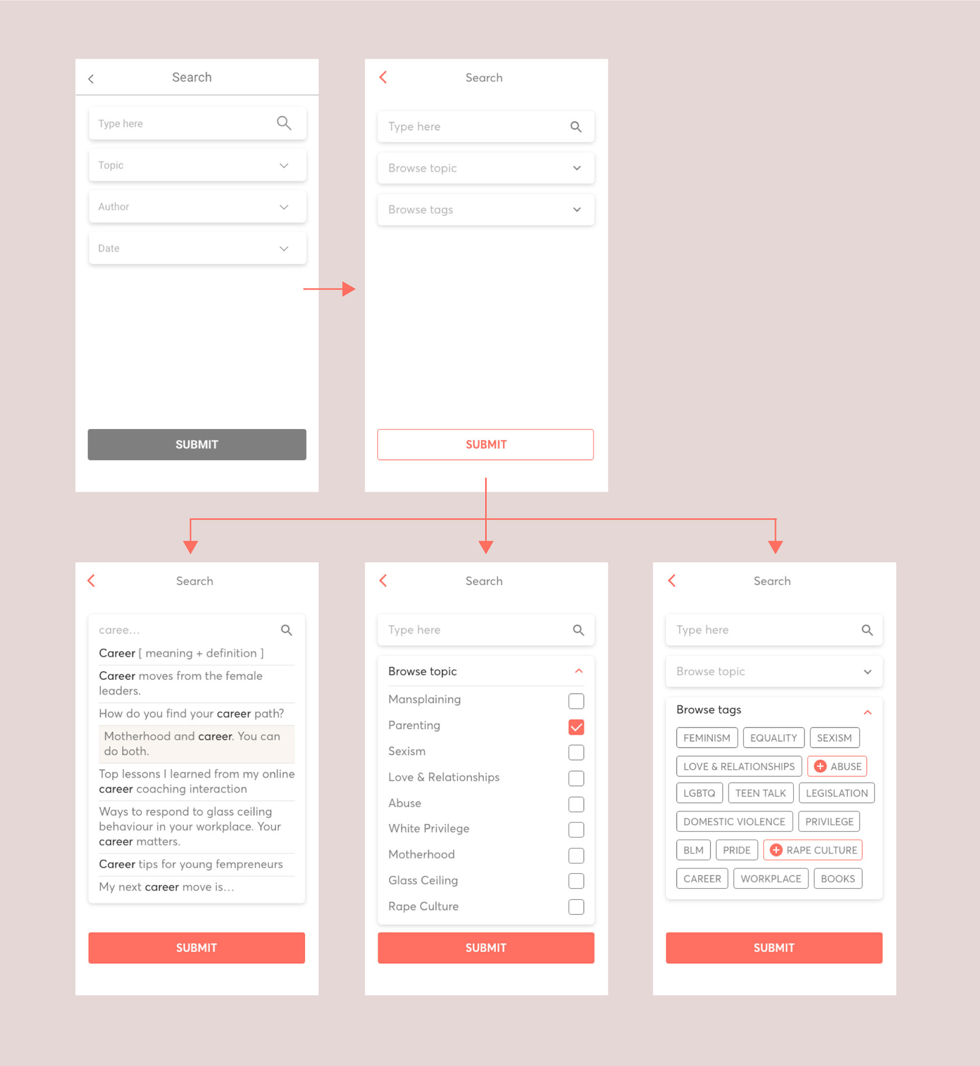
I The screen with the search options need to be explored and thought out in order to provide more alternatives.
I The experts page needs to be designed.
I The homepage needs to stand out and point out the three basic app features highlighting the experts part.
I The share your story screen should provide more options.
Applying Feedback
ERROR 1
I Users get the impression from the onboarding screens that fem+ targets womxn with serious abuse experience or other negative scenarios, while the app wants to include and engage all womxn in an empowering community.
Users talked about “unlucky” women, or abusive relationships when referring to the stories that people can share. One said, "I don’t know if I belong here". Another one gave a 10 to the overall experience and would recommend the app to a friend facing such issues.
Choosing the right words is very essential since the app is dealing with sensitive matters. Words and concepts like feminism, mental health, and violence are quite stigmatized and we need to be very careful and thoughtful with the words we are using.
Here is the new iteration of the onboarding screens with updated text:
ERROR 2
I The screen with the search options need to be explored and thought out in order to provide more alternatives.
Searching by author or date wasn't useful for the user's search. Here is the new iteration of the search screen with updated search options:
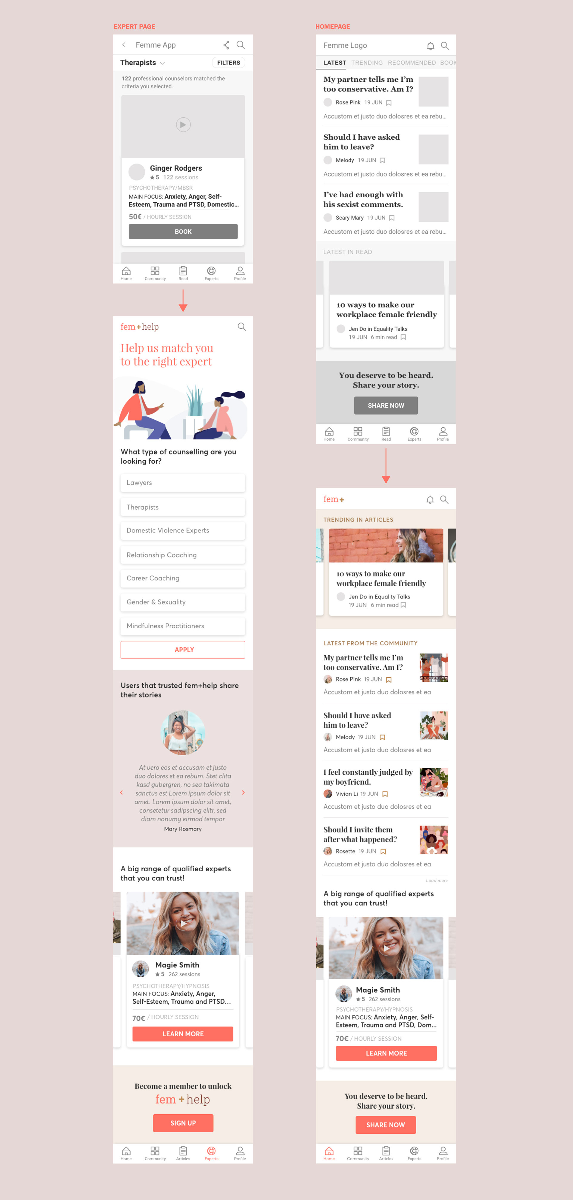
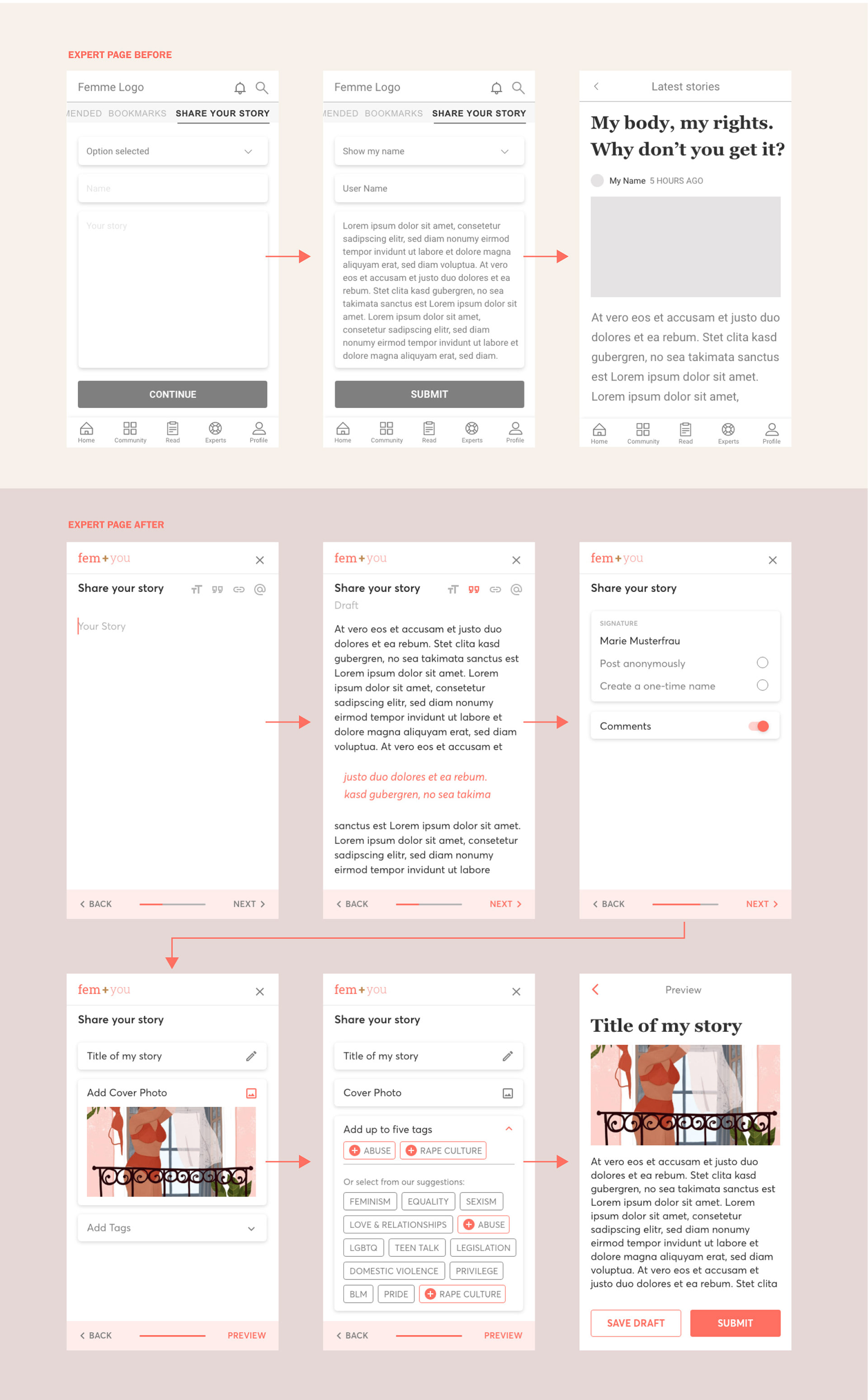
ERROR 3-4
I The experts page needs to be designed.
I The homepage needs to stand out and point out the three basic app features highlighting the experts part.
These pages had to be redesigned considering all the information that the participants shared that they expected to find there.
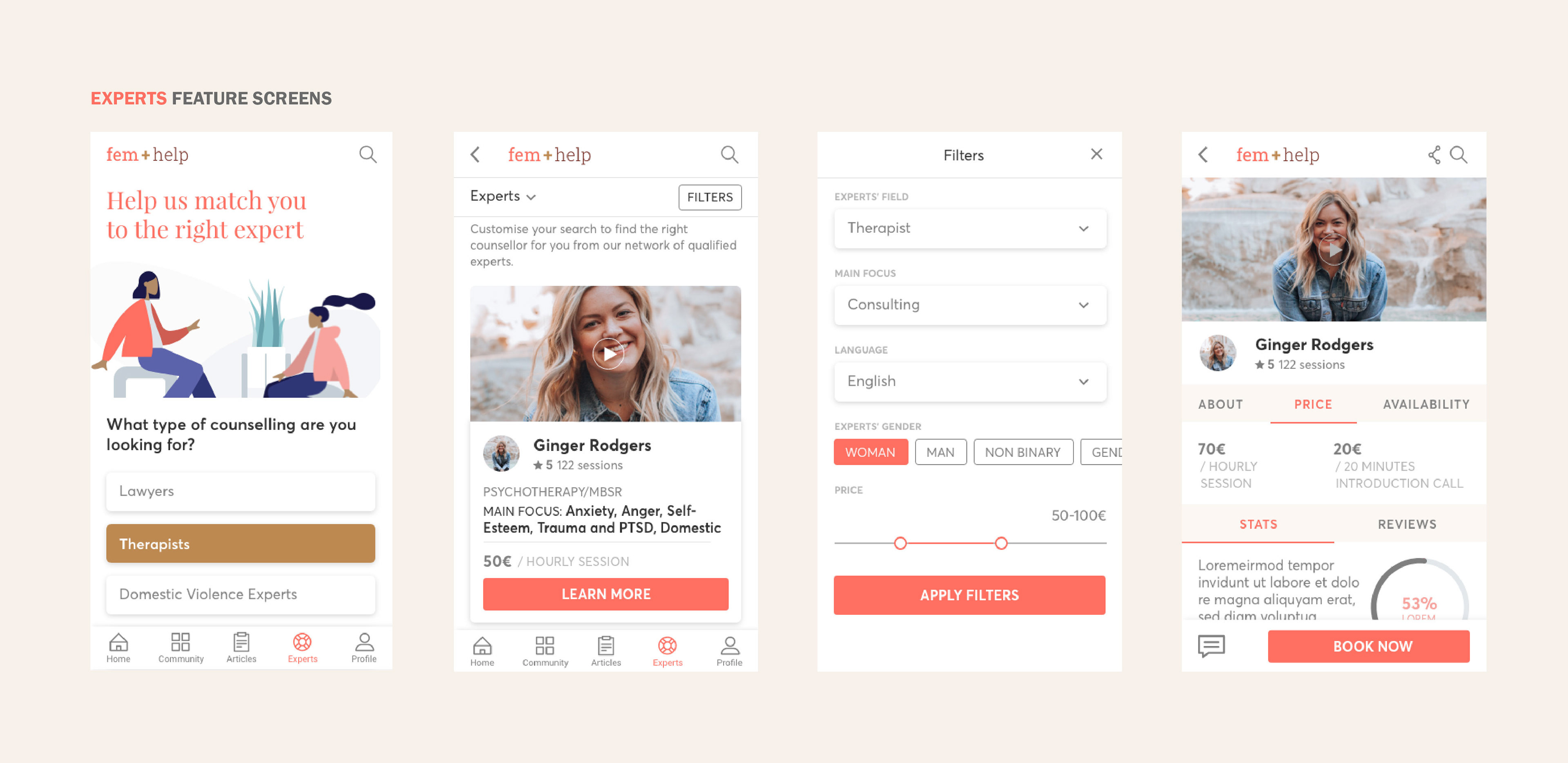
EXPERTS PAGE
The "experts" feature is very important since it's the one that makes profit. In the new iteration the user finds:
I A questionnaire that guides them to specific types of counselling.
I Positive reviews from other members.
I Expert recommendations.
I A CTA to become a member to unlock this feature.
HOMEPAGE
The user should understand by browsing the homepage what the app is about. My intention was to make that clear including:
I Introduction to the 3 basic features
- Stories from the community
- Articles from the editorial team
- Expert recommendations and CTA that leads to the experts page
I CTA to share a story.
Here are the updated versions:
ERROR 3-4
I Add some options in the share your story screen.
When the users were asked to share their stories, they expected to be able to interact more with the prototype and understand their options. In the new version I added a detailed step by step process of the feature, where the user can decide how their story will look like (select type of signature, allow/deny comments and add title, header image and tags). Without having to act on it their text is automatically saved as a draft and the app gives some options to customize the layout of the text.
Here are the updated screens:
After applying the user's feedback I implemented branding and visual design elements to the prototype.
Visual Design
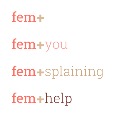
Femme became fem+. It sounds more inclusive, it conveys the idea of a starting point for everyone that is interested to join. It defines the app as a whole, and in combination with the words "you" for Community, "explaining" for Articles and "help" for Experts, it provides clarity to the user about where they are in the app.
Color Palette
I chose as the basic brand color the coral and added various combinations of colors to distinguish the different categories in the app. Symbolizing optimism and joyfulness, the coral aims to create an experience that enables connection and intimacy.

The secondary colors are some of the suggestions that pantone provides and it's a homage to skin tones around the world and the shades we use to enhance our complexions. Apart from creating a harmonic, warm and soft color palette I am very interested in the elements of diversity and inclusion that this fusion of international skin tones brings.
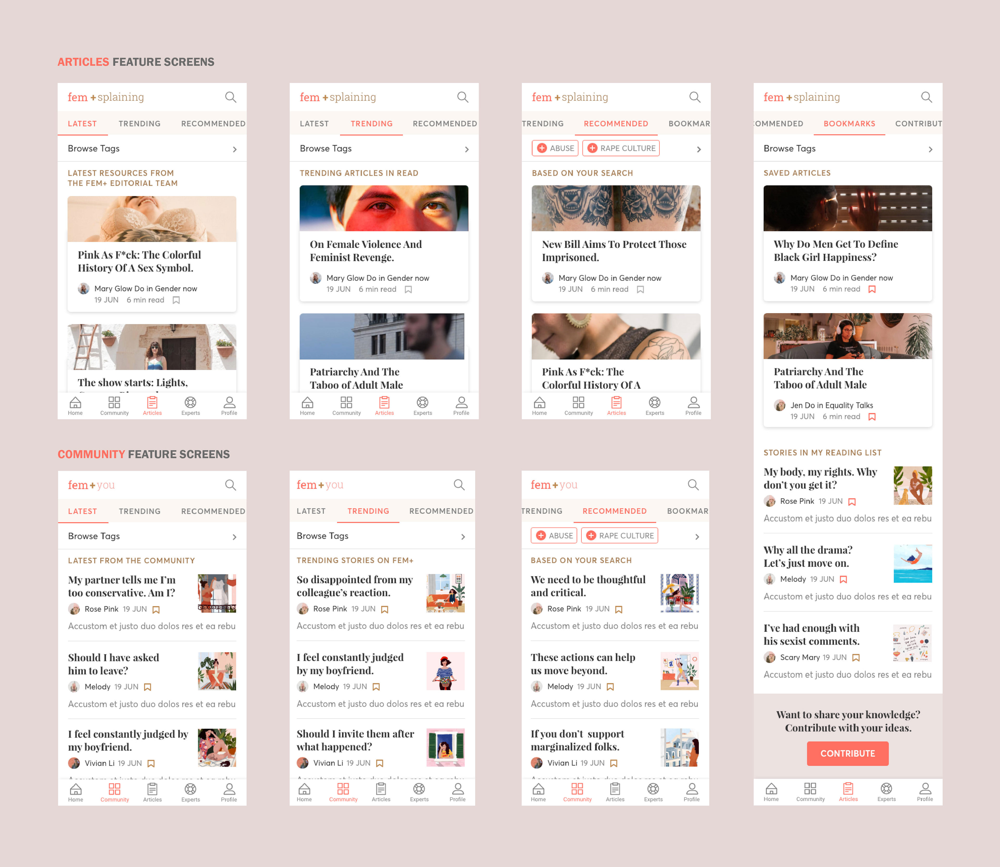
Here are some screens from the prototype after the UI design was implemented.
To showcase this project I added illustrations by Maja Tomljanovic and the humaans library, as well as images from unsplash and stocksy.
I conducted an A/B preference test to understand what kind of image/illustration is inviting the user to the app.
A/B Preference Test
I searched for illustrations that convey all those emotions that I would like to share through the app and decided to test these:
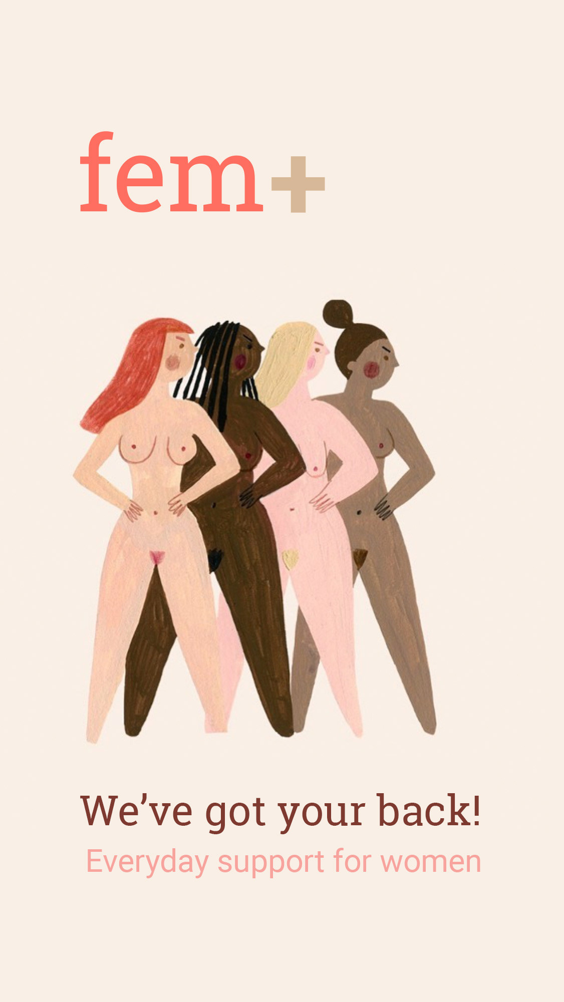
Illustration by Fotini Tikkou
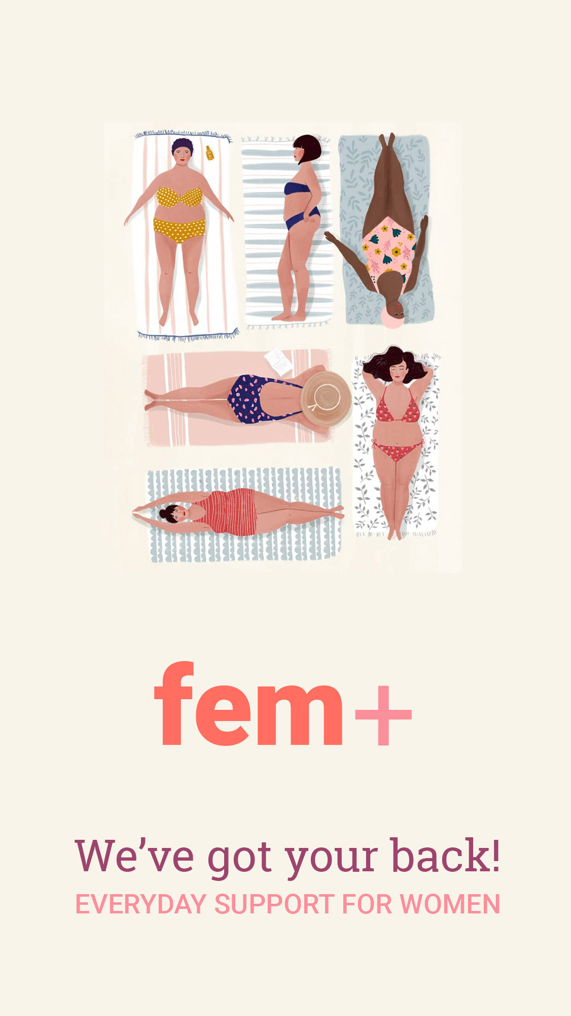
Illustration by Maja Tomljanovic
On one side an image that shows strong, powerful, nude women in a power pose.
On the other side relaxed, chilled women, chubby for the patriarchal stereotypes, enjoying the sun with their bikinis on their towels.
Sisterhood and diversity are elements of both images. The difference is in the power position or more relaxed, laid back mood.
Results
I gathered my data using Usability Hub and inviting women from my personal network.
70% of the participants voted on the 2nd screen, which shows a very clear preference for the vibes and emotions this illustration conveys. The overall feeling of the responses is that the women in the 1st screen seem aggressive.
Future Iteration
The fact that some chose the 2nd one because they didn’t like the first, makes me think that maybe a new option should be explored and tested. Keeping the relaxed, less aggressive tone and adding some diversity in body sizes, and probably some clothes, since nudity was also twice mentioned as a negative element.
Future Steps
Moving on with this project I'd like to:
I Test the updated prototype.
I Apply all the feedback I gathered from the first usability test.
I Test alternative illustrations for the splash screen.
I Add the profile feature.
I Explore and add features that improve the user experience, for example add playfulness.
For example adding a knowledge test.
This feature aims to add the elements of playfulness and gamification to the learning process. To give some initiative to users that scored low. I would implement it in the app by giving specific recommendations for further reads, based on the user’s performance. This would make the test a useful part of the learning process and provide a fun element in the overall experience.
Wow! You made it so far! Thank you so much for your attention. If you have 3 minutes more, go ahead and check this quick walkthrough.